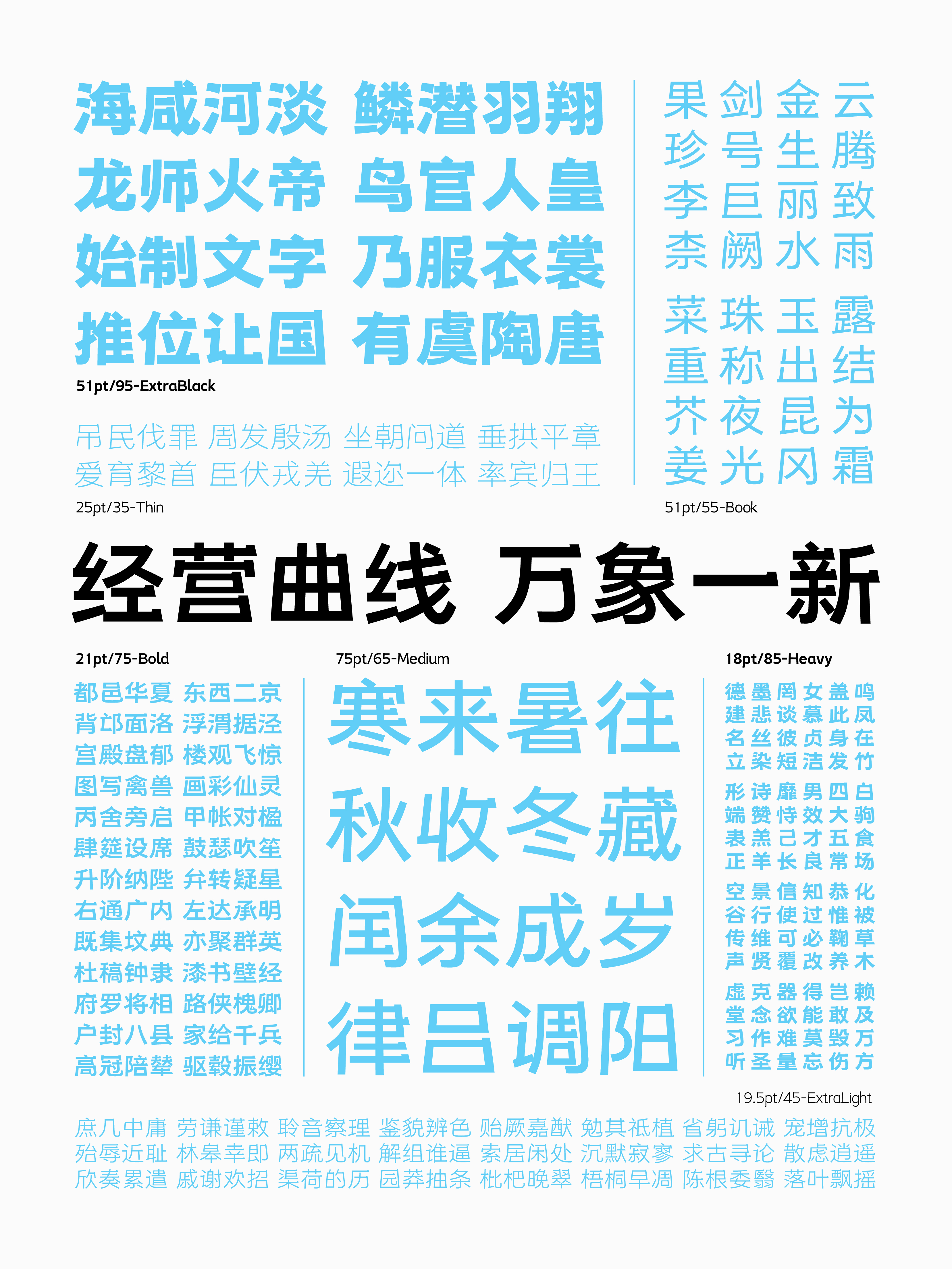
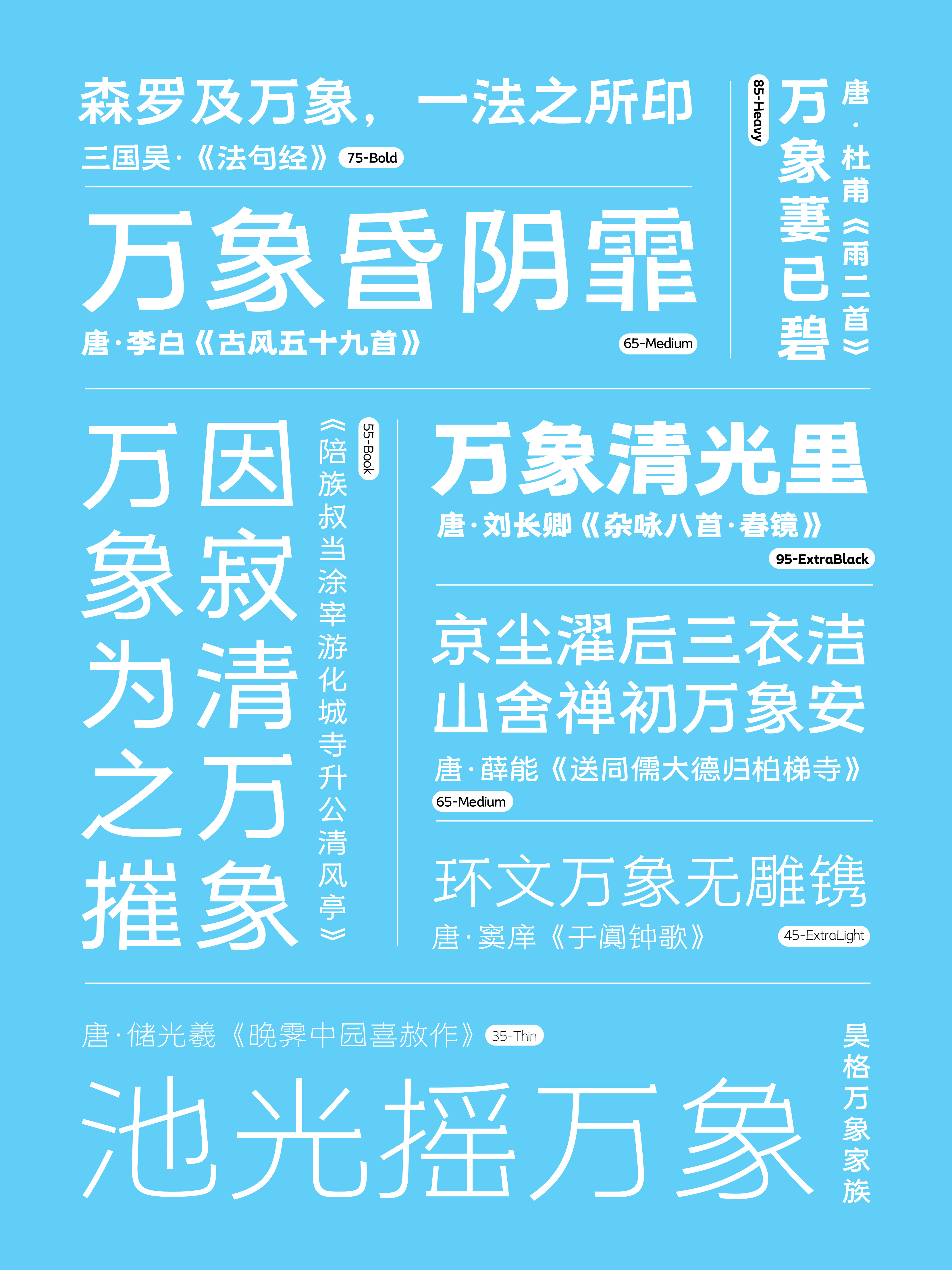
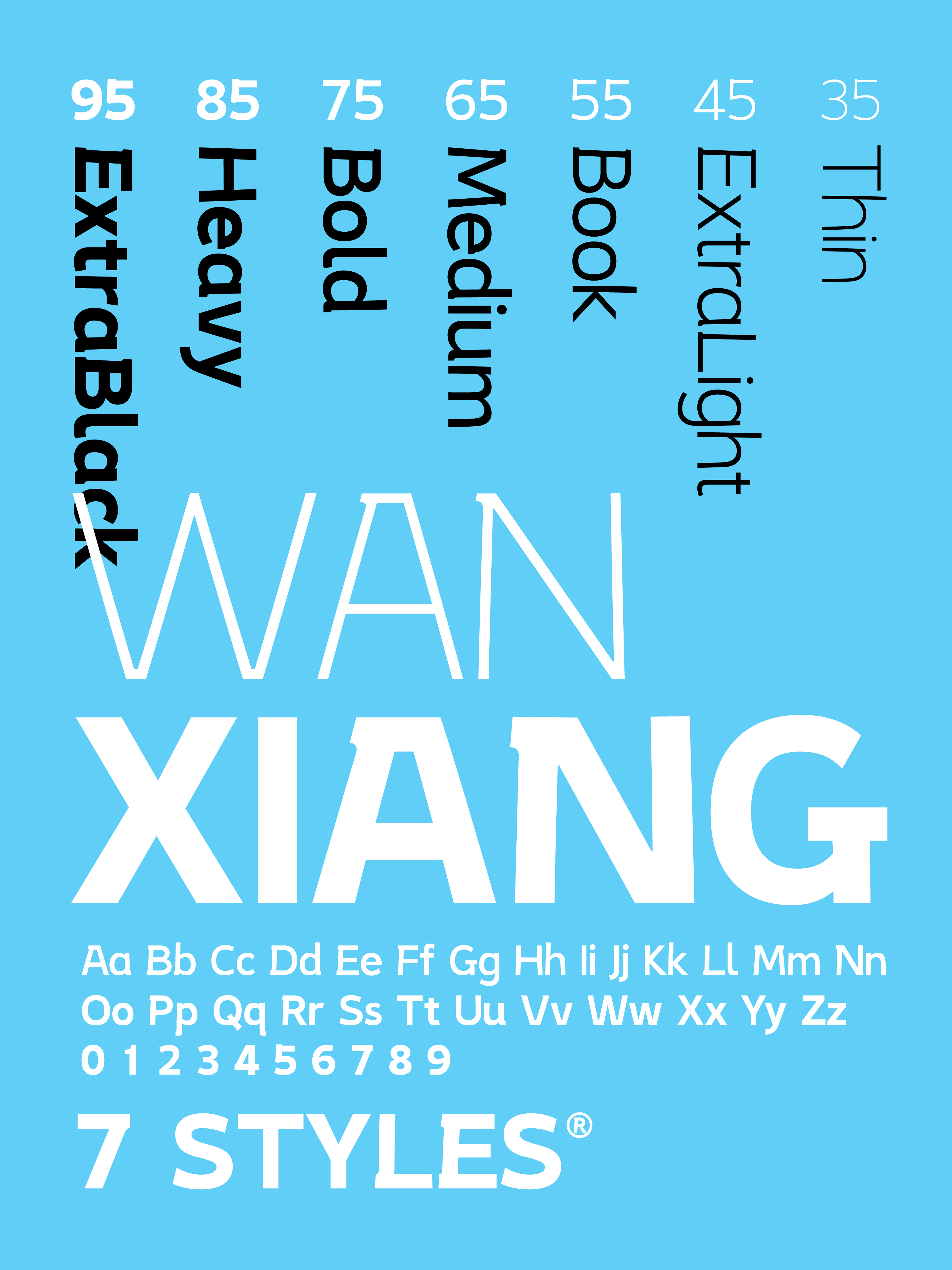
The business curve has undergone a complete transformation. The Hao Ge Wanxiang Family Font is a unique creative font series, inspired by the application of curves, and covers multiple font weights. In terms of structure, this font family innovatively adopts an upper narrow and lower wide, approximately trapezoidal font structure, presenting a unique visual effect where the center axis serves as the reference point, and the strokes converge from the periphery towards the center. In terms of pen shape, this font family uses nearly equal-line pen forms, with flat heads as the starting point, and horizontal strokes and turning points employ simple and neat decorative lines. The decorative lines inside present curvature, while the outside takes on a trapezoidal shape. The stroke design of the stroke is more curved, while the stroke of the捺 is more resilient, complementing the font structure perfectly. In terms of details, the application of curves gives the starting point of the strokes a dynamic movement towards the left, and through the curvature, it increases the expansion of the negative space, making the font more dynamic, organic and fresh. The Hao Ge Wanxiang Family Font is suitable for titles and body text, being both comfortable and pleasing to the eye, and relaxing and lively, able to add interest to reading. This font family is suitable for various application scenarios such as cultural and creative products, brand image, natural sciences, humanities and arts, academic fields, e-commerce promotion, tourism and outdoor promotion, film and television production, packaging, exhibitions, book publishing, screen reading display, etc.





 吉隆坡办公室 Pantai Hillpark Phase 1 Jalan Pantai Murni 1, Pantai Dalam 59200 Kuala Lumpur, Malaysia 区域合作网络 香港 · 首尔
 +60 11-1668 7852
 official@asia-design-week.com