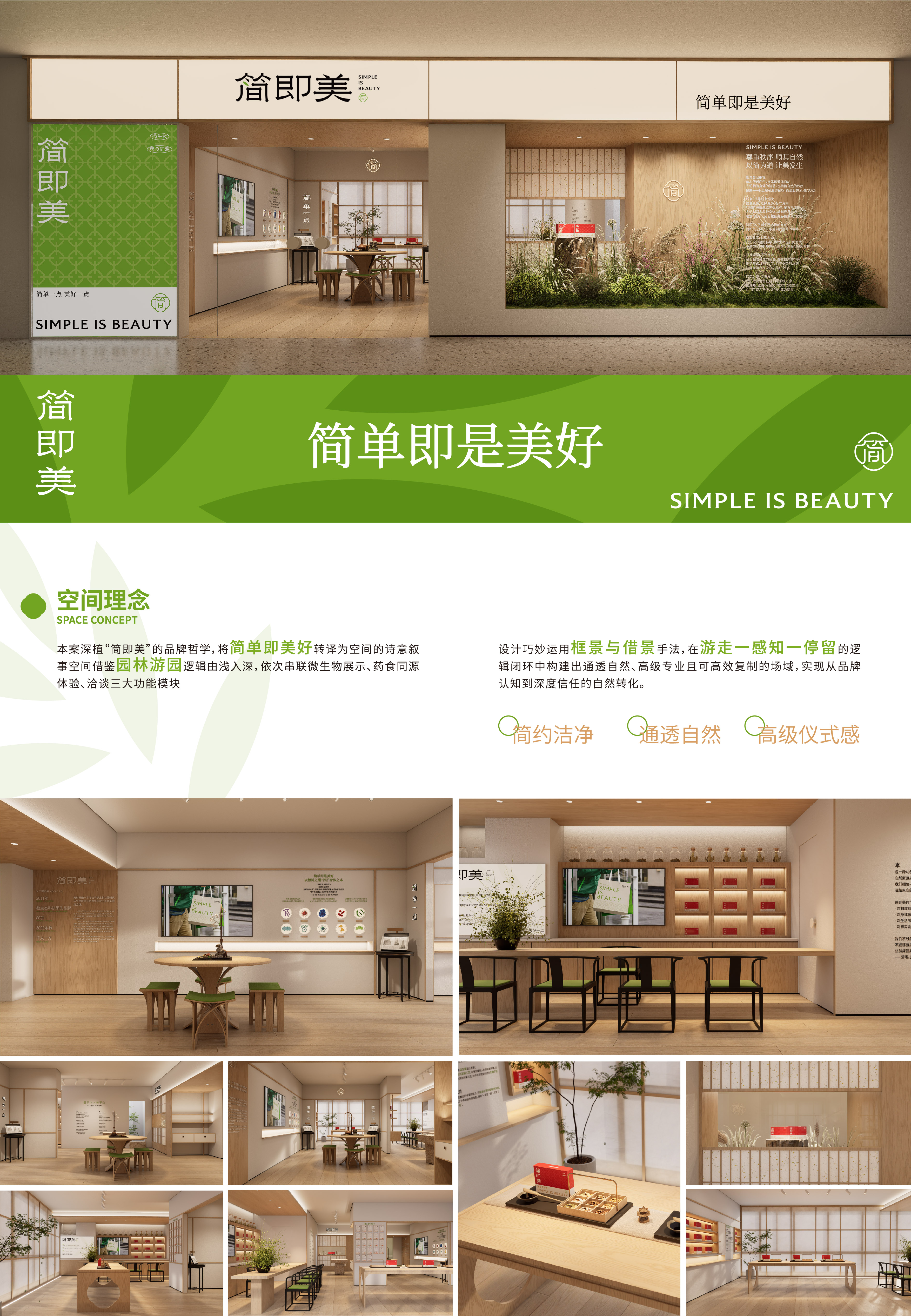
Jian Mei is a microecological functional health brand dedicated to the research of microbial functions and the transformation of biomedical technologies. Since 2011, the brand has continuously deepened its exploration in the field of fermented probiotics derived from food and medicine, and has established a complete research and industrial system.
In the context of the continuous upgrading of health consumption, people's demand for health brands has shifted from basic functional requirements to emotional value, aesthetic recognition, and lifestyle experiences. However, the visual expression of the health industry is generally trending towards functionality, parameterization, and anxiety. Excessive information stimulation is weakening the originally natural relationship between people and health.
Based on this observation, we rethought the expression of health brands: Does health necessarily need to be established through anxiety? Can a more restrained, natural, and warm design language be used to establish a more comfortable connection between people and health?
Therefore, the project proposed the brand concept of "Simple in essence, beautiful in heart".
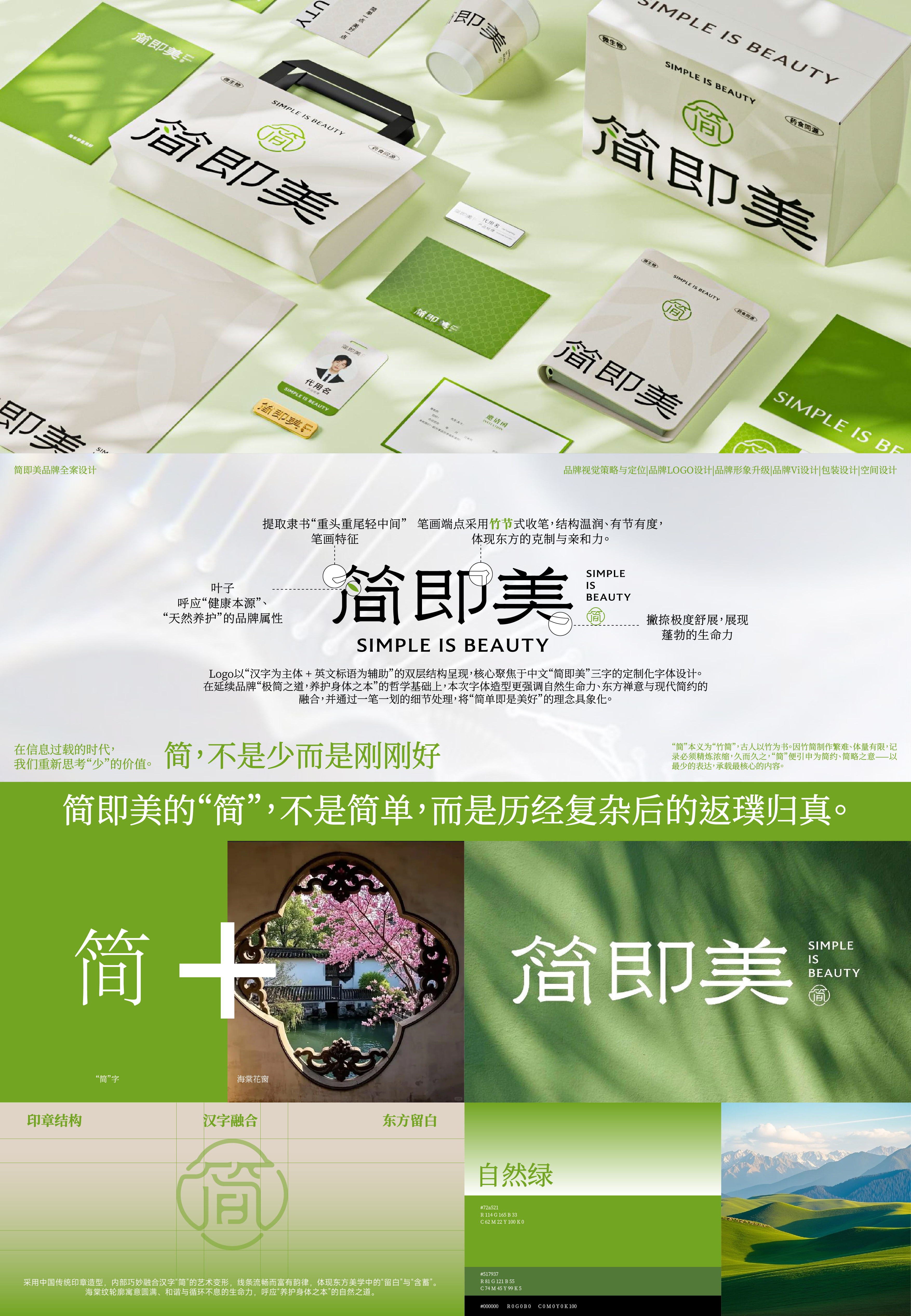
"Simple" is not simple; it is the return to the essence after complex experiences. It represents respect for natural laws, trust in the wisdom of the body, and attention to real needs; "Beautiful" is not the result of deliberate shaping, but a natural state that emerges after the restoration of balance between the body, emotions, and life. Jian Mei, which means "beauty", hopes to achieve a milder and more authentic brand expression, allowing health to return to the natural rhythm of occurrence and life to return to its original order.
In the design aspect, the project takes Eastern minimalist aesthetics as the core language, starting from the idea of "simplicity" in traditional Chinese philosophy, and builds a complete brand ecosystem covering brand logo, visual identity system, packaging system, and spatial experience. The overall visual design abandons the common technological accumulation and efficacy anxiety expression in the health industry. Through restrained visual order, natural-growing auxiliary graphics, soft natural color tone system, and breathing-like blank space design, it creates a quiet, pure, and emotionally charged brand atmosphere.
The packaging system builds a product matrix with a unified and hierarchical visual logic. While retaining the brand's core logo and slogan, it establishes product identification through natural-growing auxiliary graphics and differentiated color systems. Different products match corresponding visual emotional colors - soothing light green, energetic bright yellow, gentle light purple, and calm dark blue, strengthening product recognition while forming a unified and rich brand visual order. The overall packaging continues the characteristics of Eastern minimalist aesthetics, expressing the brand's advocated balance, nature, and authenticity of health concepts through restrained layout, natural colors, and breathing-like blank space. The space design further extends the brand concept to the experience scene, using natural materials, soft lighting, and open blank space to build a more relaxed interaction relationship between people and the brand, and between people and health, extending the brand experience from product consumption to life perception.
The project hopes to use "simplicity is beauty" as the core design concept, conveying the contemporary Eastern aesthetic concepts of balance, nature, and authenticity in life, making the brand not only remain at the functional consumption level, but also become a contemporary lifestyle expression that combines emotional perception and spatial experience.





 吉隆坡办公室 Pantai Hillpark Phase 1 Jalan Pantai Murni 1, Pantai Dalam 59200 Kuala Lumpur, Malaysia 区域合作网络 香港 · 首尔
 +60 11-1668 7852
 official@asia-design-week.com